Table of Contents
ToggleChoosing the right paint color for a living room can feel like walking a tightrope. Too bold, and you’re repainting in six months. Too safe, and the room falls flat. That’s where neutrals earn their keep, they provide a versatile backdrop that works with changing décor, natural light shifts throughout the day, and evolving design trends. But “neutral” doesn’t mean boring. The right shade can make a room feel cozy, spacious, modern, or classic depending on undertones and finish. This guide breaks down twelve proven neutral paint colors across warm, cool, and true neutral categories, plus practical advice on testing and application so the color on your wall matches what you envisioned.
Key Takeaways
- Neutral living room paint colors provide a versatile backdrop that adapts to changing décor, natural light shifts, and design trends without visual fatigue.
- Warm neutrals like Accessible Beige and Shaker Beige work best in rooms with limited natural light, while cool neutrals like Repose Gray suit spaces with abundant sunlight and modern aesthetics.
- Test paint samples directly on your walls under different lighting conditions (morning, midday, and evening) for at least 48 hours before committing to ensure the color matches your vision.
- Your room’s natural light direction, existing finishes, and furniture colors should guide your neutral paint selection—north-facing rooms suit warm neutrals, while south-facing spaces benefit from cool grays.
- Quality preparation, including wall cleaning, sanding, and priming, combined with proper application techniques (W-pattern rolling and maintaining wet edges) ensures even coverage and professional results.
- True neutral greiges like Revere Pewter and Edgecomb Gray offer maximum versatility for open floor plans and work cohesively room-to-room without clashing with accent colors or shifting décor.
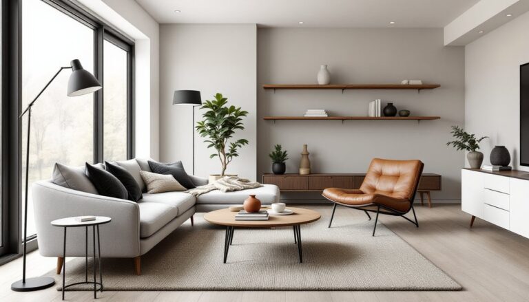
Why Neutral Paint Colors Work Best for Living Rooms
Neutral paint colors deliver flexibility that bright or saturated hues can’t match. Living rooms serve multiple functions, entertaining, relaxing, working from the couch, and neutrals adapt to all of them without visual fatigue.
From a practical standpoint, neutrals maximize resale appeal. Potential buyers can picture their own furniture and style preferences against a blank canvas. If you’re planning to sell within five years, sticking with neutrals is a safe bet.
Neutrals also play well with natural and artificial lighting. A warm beige reads differently under north-facing window light versus recessed LED fixtures. Because neutrals have subtle undertones rather than strong pigment, they shift gracefully as light conditions change throughout the day instead of looking washed out or garish.
Finally, they simplify decorating decisions. When walls are neutral, you can swap throw pillows, rugs, or artwork seasonally without clashing. You’re not locked into a color story dictated by electric blue walls.
Warm Neutral Paint Colors That Create Cozy Living Spaces
Warm neutrals carry yellow, red, or orange undertones that add subtle richness and make a room feel inviting. They work especially well in living rooms with limited natural light or spaces you want to feel intimate.
Accessible Beige (Sherwin-Williams SW 7036) is a go-to for a reason. It’s a soft, greige (gray-beige hybrid) with warm undertones that pairs with both modern and traditional furnishings. It reads warmer than most grays without tipping into tan territory.
Balboa Mist (Benjamin Moore OC-27) offers a slightly cooler take on warm neutrals. It has enough warmth to feel welcoming but enough gray to keep it contemporary. It’s a chameleon, looks different in morning versus evening light, so test it thoroughly.
Shaker Beige (Benjamin Moore HC-45) leans more traditional with creamy yellow undertones. It’s ideal for modern farmhouse living rooms or spaces with warm wood floors and trim. Avoid it in rooms with strong yellow artificial lighting, or it can look dingy.
Kilim Beige (Sherwin-Williams SW 6106) sits between beige and greige with soft, sandy undertones. It’s warmer than most greiges and works well in open-concept layouts where you need a color that flows from room to room without jarring transitions.
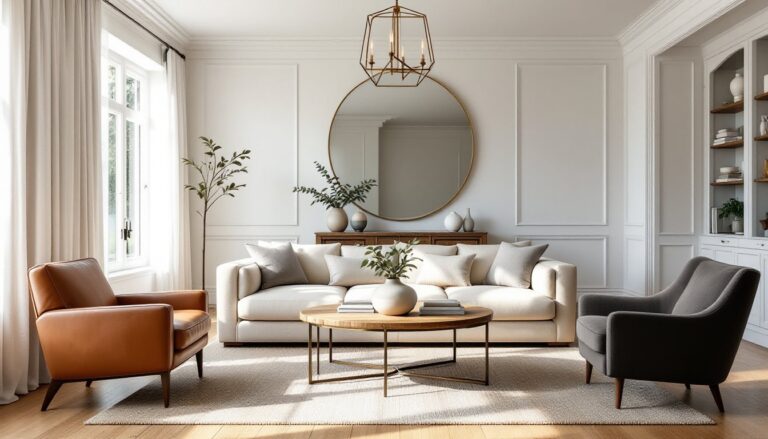
Cool Neutral Paint Colors for Modern, Calming Interiors
Cool neutrals contain blue, green, or violet undertones that create a more contemporary, airy feel. They’re excellent choices for living rooms with abundant natural light or spaces where you want to enhance a sense of calm.
Repose Gray (Sherwin-Williams SW 7015) is one of the most popular cool grays for good reason. It’s a true mid-tone gray with minimal undertones, making it predictable and versatile. It works in small living rooms where you need a color that won’t shrink the space visually.
Gray Owl (Benjamin Moore OC-52) is lighter with a hint of blue-green that becomes more apparent in certain lighting. It’s a sophisticated choice that pairs beautifully with white trim and cool-toned flooring. Test it on multiple walls, it can shift from gray to almost seafoam depending on light exposure.
Agreeable Gray (Sherwin-Williams SW 7029) bridges warm and cool categories but leans slightly cool. It’s incredibly versatile and forgiving, which is why it’s a contractor favorite. It coordinates with virtually any accent color and doesn’t clash with existing finishes.
Stonington Gray (Benjamin Moore HC-170) is a classic coastal neutral with soft blue-gray undertones. It’s perfect for coastal living rooms or any space where you want a crisp, clean backdrop. Use it with an eggshell or satin finish to enhance its subtle depth.
True Neutral Paint Colors for Maximum Versatility
True neutrals sit at the intersection of warm and cool, with balanced undertones that make them the most adaptable options. They’re excellent for open floor plans or homes where you want a cohesive color that works room-to-room.
Classic Gray (Benjamin Moore OC-23) is a warm gray that doesn’t lean too beige or too blue. It’s a reliable choice that looks consistent under various lighting conditions, making it easier to work with than more temperamental neutrals.
Edgecomb Gray (Benjamin Moore HC-173) is a soft, warm greige that works in almost any setting. It has just enough warmth to feel welcoming but enough gray to stay modern. It’s particularly effective in living rooms with elegant design elements like crown molding or wainscoting.
Worldly Gray (Sherwin-Williams SW 7043) is a true greige that reads neutral in most lighting. It’s slightly warmer than Repose Gray but cooler than Accessible Beige, landing squarely in the middle. It’s a solid choice if you’re indecisive between warm and cool palettes.
Revere Pewter (Benjamin Moore HC-172) is the most popular neutral for a reason, it’s a balanced greige that works in virtually any space. It has enough warmth to feel cozy but enough gray to stay contemporary. Be aware it can look more beige in rooms with warm light and more gray in cooler light, so extensive testing is essential.
How to Choose the Right Neutral Shade for Your Living Room
Start by assessing your room’s natural light. North-facing rooms receive cooler, indirect light that can make cool grays feel cold and uninviting. Warm neutrals work better here. South-facing rooms get warm, direct light throughout the day, so cool neutrals balance that warmth without feeling sterile.
Consider your existing finishes. If you have warm oak floors or honey-toned wood trim, cool grays can create an unintentional clash. Warm neutrals or true greiges harmonize better. Conversely, if you have cool-toned tile, gray carpet, or painted white trim, cool neutrals typically look more cohesive.
Think about your furniture and décor. Many designers recommend selecting wall colors that complement your largest furniture pieces. If your sofa is a warm caramel leather, a cool gray wall might look disjointed. A warm beige or greige creates better flow.
Lightbulb color temperature matters more than most people realize. Warm white bulbs (2700K-3000K) add yellow light that can make cool grays look muddy or dingy. Daylight bulbs (5000K-6500K) add blue light that can make warm beiges look washed out. Choose your bulbs before finalizing your paint selection, or test paint samples under your intended lighting.
Finally, consider the mood you want. Warm neutrals feel cozier and more traditional. Cool neutrals feel more modern and spacious. True neutrals split the difference and offer maximum flexibility for future décor changes.
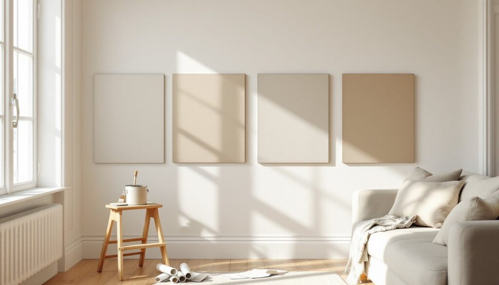
Tips for Testing and Applying Neutral Paint Colors
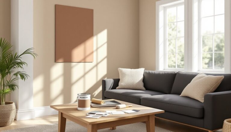
Never choose paint based on a paint chip alone. Those tiny samples look completely different at wall scale. Purchase sample pots (usually 8 oz) and paint at least two 2’×2′ squares on different walls, one that gets direct light and one that doesn’t.
Paint samples directly on the wall, not poster board. The existing wall color, texture, and sheen affect how the new color reads. If your walls are currently dark, you may need two coats of sample paint to see the true color.
Live with samples for at least 48 hours before deciding. Check them in morning light, midday sun, and evening artificial light. Many neutrals that look perfect at noon can look entirely different under evening LED lighting.
When you’re ready to paint, proper prep work determines the final result. Clean walls thoroughly with a TSP substitute to remove grease and dirt that prevent paint adhesion. Fill nail holes and dings with spackle, let dry completely, then sand smooth with 120-grit sandpaper. Prime if you’re making a dramatic color change (dark to light or vice versa) or painting over uncoated drywall. A quality primer like Zinsser Bulls Eye 1-2-3 ensures even color coverage.
Use quality paint, it covers better and lasts longer. For living rooms, eggshell or satin finishes are ideal. They’re durable enough to wipe down but don’t highlight wall imperfections like semi-gloss. One gallon typically covers 350-400 square feet with one coat, but neutrals often require two coats for even coverage, especially lighter shades.
Cut in edges with a quality 2.5-inch angled brush before rolling. Use a 3/8-inch nap roller for smooth walls, 1/2-inch nap for light texture. Roll in a W pattern to distribute paint evenly and avoid lap marks. Maintain a wet edge by working in manageable sections and not letting painted areas dry before rolling adjacent sections.
Safety note: Ensure adequate ventilation when painting. Open windows and use fans to circulate air. Wear a dust mask when sanding and gloves to avoid skin contact with paint and chemicals.
Conclusion
The right neutral paint transforms a living room from generic to intentional without locking you into a rigid design scheme. Whether you lean toward warm beiges, cool grays, or balanced greiges, the key is thorough testing under your specific lighting conditions and careful application. Take the time to prep properly, use quality materials, and don’t rush the decision. A well-chosen neutral is a backdrop that’ll serve you for years.