Table of Contents
ToggleA moody living room isn’t about making a space feel dark or unwelcoming, it’s about creating intentional drama through color, lighting, and texture. This aesthetic has gained serious traction in 2026, moving beyond Pinterest boards into real homes where homeowners are trading safe neutrals for richer, more atmospheric interiors. Done right, a moody space feels cocooning and sophisticated, not gloomy. The key is balancing deep tones with thoughtful lighting and layered materials. This guide walks through the building blocks of moody design, from wall treatments to furniture choices, with practical tips for pulling off the look without needing a designer’s budget or a contractor’s expertise.
Key Takeaways
- Moody living room ideas thrive on contrast, saturation, and controlled lighting—deep saturated hues like charcoal, navy, and forest green work best when layered with metallics and texture to avoid a flat, lifeless appearance.
- Multiple intentional light sources including dimmable overhead fixtures, task lamps, and accent lighting are essential to creating depth and preventing dark spaces from feeling oppressive.
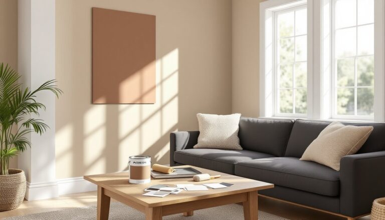
- Dark wall colors require quality primer and at least two coats of matte or eggshell finish paint to achieve full saturation and avoid uneven coverage.
- Texture through velvet upholstery, leather accents, board-and-batten wall treatments, and natural materials like wool rugs prevents a moody room from feeling cavernous and adds luxury.
- Furniture with clean lines and substantial dark finishes, combined with intentional layout that groups seating around focal points, creates intimate spaces that feel cocooning rather than cramped.
- Curated accessories like large-scale artwork in metallic frames, strategic mirrors, potted plants, and layered throw pillows in complementary accent tones complete the moody aesthetic without visual clutter.
What Makes a Living Room “Moody”?
Moody design relies on contrast, saturation, and controlled light. It’s not just painting walls black and calling it done. The aesthetic borrows from traditional libraries, vintage cocktail lounges, and even theatrical spaces, places where atmosphere matters as much as function.
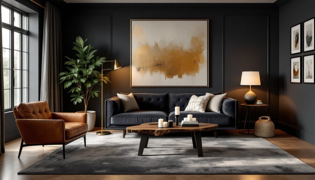
A moody room typically features deep, saturated hues (charcoal, navy, forest green, burgundy, or even chocolate brown) as the dominant color. These tones absorb light rather than reflect it, creating visual weight and intimacy. That’s the foundational layer.
But here’s where it gets interesting: moody doesn’t mean monochromatic. The best examples layer in metallics (brass, aged bronze, matte black hardware), rich wood tones, and textural contrast through fabrics and finishes. Without these layers, a dark room can flatten out and feel lifeless.
Lighting is non-negotiable. Since dark surfaces eat ambient light, moody spaces rely on multiple, intentional light sources, table lamps, sconces, dimmable overhead fixtures, to create pools of illumination and shadow. This interplay is what gives the room its depth and drama.
Dark Color Palettes That Set the Tone
Choosing the right dark color is half the battle. Not all deep tones perform the same way under different lighting conditions or in rooms with varying amounts of natural light.
Charcoal and slate grays are the most forgiving. They read neutral enough to work with a wide range of accent colors but still deliver that moody punch. Benjamin Moore’s “Kendall Charcoal” and Sherwin-Williams’ “Iron Ore” are commonly used for a reason, they don’t shift too warm or cool depending on the light.
Navy blues bring richness without feeling heavy. Farrow & Ball’s “Hague Blue” and Behr’s “Starless Night” are popular picks. Navy pairs well with brass fixtures and natural wood, which helps warm up the space.
Forest and emerald greens offer a more organic, slightly unexpected vibe. These work especially well in rooms with strong natural light during the day. They’re dramatic but not as stark as pure black.
True blacks and near-blacks (like Sherwin-Williams’ “Tricorn Black” or Benjamin Moore’s “Black Beauty”) are bold moves. They work best in larger rooms with high ceilings and ample layered lighting strategies. In smaller spaces, they can feel oppressive unless offset with reflective surfaces and warm-toned accents.
When painting, use a matte or eggshell finish on walls. Glossier finishes reflect light unevenly and can highlight imperfections. Trim and molding can go semi-gloss in a slightly lighter shade (or the same color) to add subtle definition without breaking the mood.
One gallon of quality interior paint typically covers 350–400 square feet per coat. Most dark colors require at least two coats over a tinted primer to achieve full saturation. Skipping primer is a mistake, it leads to uneven coverage and wasted paint.
Layered Lighting for Depth and Ambiance
In a moody living room, lighting does more than illuminate, it sculpts the space. The goal is to avoid a single overhead source and instead build layers that can be adjusted for mood and function.
Start with ambient lighting: this is your baseline. A dimmable overhead fixture (chandelier, flush-mount, or recessed cans) provides general illumination. Install a dimmer switch if you don’t have one, this is a straightforward DIY swap using a basic screwdriver and wire nuts, though you’ll want to kill power at the breaker first. Always check local electrical codes and verify compatibility with LED bulbs if that’s what you’re using.
Task lighting fills in the gaps. Floor lamps next to seating, swing-arm sconces flanking a sofa, or a table lamp on a console all add functional light without flooding the room. Aim for 2,700–3,000 Kelvin bulbs (warm white) to maintain a cozy, inviting feel. Cooler temps will make dark colors feel sterile.
Accent lighting is where the drama lives. Picture lights over artwork, LED strips tucked behind floating shelves, or small uplights in corners add dimension and highlight architectural features. Designers on platforms like MyDomaine often emphasize this layer to prevent moody rooms from reading flat.
Candlelight and fireplace glow also count. If the living room includes a hearth, that flickering light becomes a natural focal point and warms up dark walls in a way electric fixtures can’t quite replicate.
Avoid the temptation to over-light. Moody design embraces shadow. A room that’s evenly lit from every angle loses the atmospheric quality that makes the aesthetic work.
Texture and Materials That Add Drama
Flat, one-dimensional surfaces kill the moody vibe. Texture is what keeps a dark room from feeling like a cave.
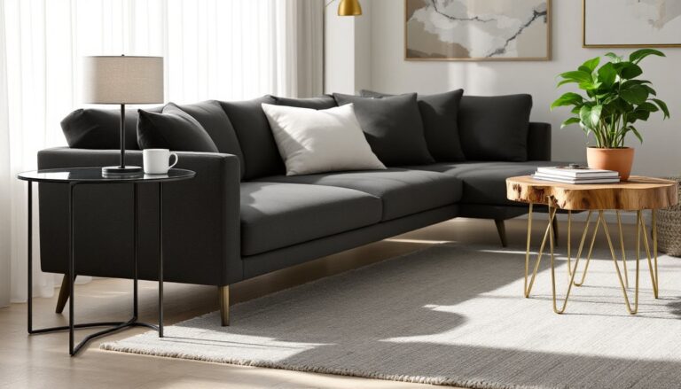
Velvet upholstery is a go-to. It catches and reflects light in a way that adds subtle movement. A velvet sofa in deep teal, charcoal, or even black introduces luxury without the need for pattern. Velvet also dampens sound slightly, which adds to the cocooning effect.
Leather and distressed hides bring warmth and a lived-in quality. A worn leather armchair or ottoman in cognac or espresso tones contrasts beautifully with cool-toned walls.
On floors, consider dark-stained hardwood or luxury vinyl plank in espresso or walnut finishes. If the existing floor is light, a large area rug in a deep tone (charcoal, navy, or patterned in muted colors) anchors the space. Jute or wool rugs add tactile interest underfoot.
Wall treatments go beyond paint. Shiplap, board-and-batten, or picture molding painted in the same dark hue as the walls adds architectural depth. If you’re handy with a miter saw and nail gun, installing board-and-batten is a weekend project. Use 1×4 or 1×6 boards (actual dimensions: 3/4″ x 3.5″ or 3/4″ x 5.5″) spaced evenly. Fill nail holes with wood filler, caulk seams, then prime and paint.
Metallics matter. Brass, bronze, or matte black hardware and fixtures prevent the space from feeling too soft. Think drawer pulls, curtain rods, lamp bases, and picture frames. These small touches add just enough gleam to catch the eye without overwhelming.
Don’t overlook window treatments. Heavy linen or velvet drapes in coordinating dark tones frame windows and improve light control. Blackout lining is optional but useful if the room doubles as a media space.
Furniture and Layout Choices for Moody Spaces
Furniture in a moody living room should feel substantial but not bulky. The aesthetic leans traditional-meets-modern, with clean lines and rich finishes.
Sofas and seating in deep, saturated fabrics or leather work best. A charcoal linen sectional or a navy velvet Chesterfield both fit the bill. Avoid overly trendy silhouettes, moody design has a timeless quality, so classic shapes (rolled arms, tufted backs, low-profile modern frames) age better.
Coffee tables and side tables in dark wood, marble, or metal continue the layered aesthetic. A walnut coffee table with a live edge or a marble-top console with brass legs adds visual interest without competing for attention. Avoid glass tops in moody spaces, they don’t contribute to the weight and richness the aesthetic requires.
Layout matters, especially in smaller rooms. Pulling furniture slightly away from walls and creating conversation zones helps the space feel intentional rather than cramped. In a moody room, the goal is intimacy, not openness. Grouping seating around a focal point, fireplace, large artwork, or picture window, anchors the design.
Built-ins or open shelving painted to match the walls create a seamless look. Floating shelves in matte black metal brackets or thick wood slabs (at least 1.5″ thick for stability) provide display space for books, ceramics, or plants without breaking up the color flow.
If the living room connects to other spaces, consider how the moody palette transitions. An abrupt shift from dark walls to bright white in an adjoining hallway can feel jarring. Gradual transitions, using a slightly lighter shade or carrying an accent color through, smooth the flow.
Accent Pieces and Finishing Touches
The details tie everything together. In moody design, accessories should feel curated, not cluttered.
Artwork stands out against dark walls. Large-scale pieces in gold or white frames create contrast. Black-and-white photography, abstract paintings with metallic accents, or botanical prints in muted tones all work. Hang art at eye level (typically 57–60 inches to the center of the piece) and use picture lights or sconces to highlight them.
Mirrors are functional and strategic. A large mirror with an ornate gold or matte black frame reflects light and makes the room feel larger. Position mirrors opposite windows or light sources to maximize their impact.
Greenery breaks up dark palettes without clashing. Large potted plants (fiddle leaf figs, rubber plants, monstera) in ceramic or woven planters add organic texture. Smaller succulents or trailing pothos on shelves soften hard lines.
Throw pillows and blankets in complementary textures, chunky knit, faux fur, linen, invite use and add comfort. Stick to a cohesive color palette with 2–3 accent tones (burnt orange, mustard, blush, or cream) to avoid a chaotic look.
Bookshelves styled with a mix of books (spines facing out or stacked horizontally), decorative objects, and empty space prevent visual overload. Group items in odd numbers (3 or 5) for balance.
Candles in sculptural holders, vintage or antique finds, and ceramics in earthy glazes add personality. Spaces featured on House Beautiful often layer in these tactile, lived-in elements to keep the aesthetic from feeling too staged.
Finally, consider scent. A moody room benefits from ambient fragrance, woodsy candles, incense, or diffusers with notes of cedar, tobacco, or leather enhance the sensory experience.
Conclusion
Pulling off a moody living room comes down to balance, rich color, intentional lighting, layered texture, and thoughtful details. It’s not a paint-and-done project. The aesthetic requires commitment to the mood and patience with the details. But for homeowners willing to embrace darker tones and rethink how light and shadow work in a space, the result is a living room that feels distinctly atmospheric and unmistakably personal.