Table of Contents
ToggleChoosing paint for a living room isn’t just about picking a pretty swatch. It’s about creating a backdrop that works with your furniture, lighting, and how you actually use the space. Get it right, and your living room feels pulled together without much else. Get it wrong, and even expensive furniture looks off. This guide walks through practical color strategies, finish options, and application techniques that make a difference, no lifestyle fluff, just what works on real walls.
Key Takeaways
- Test paint samples on multiple walls in different lighting conditions for 2–3 days before committing, as paint ideas for living rooms shift dramatically between morning and evening light.
- Warm tones like warm taupe and greige work best in north-facing rooms with cooler light, while cool blues and grays work better in bright, south-facing spaces with natural light.
- Eggshell finish is the ideal choice for most living rooms, offering the balance between hiding imperfections, durability, and washability that flat or satin finishes can’t match.
- Bold and saturated colors require at least two to three coats of quality paint and a tinted primer to avoid translucency and ensure professional results.
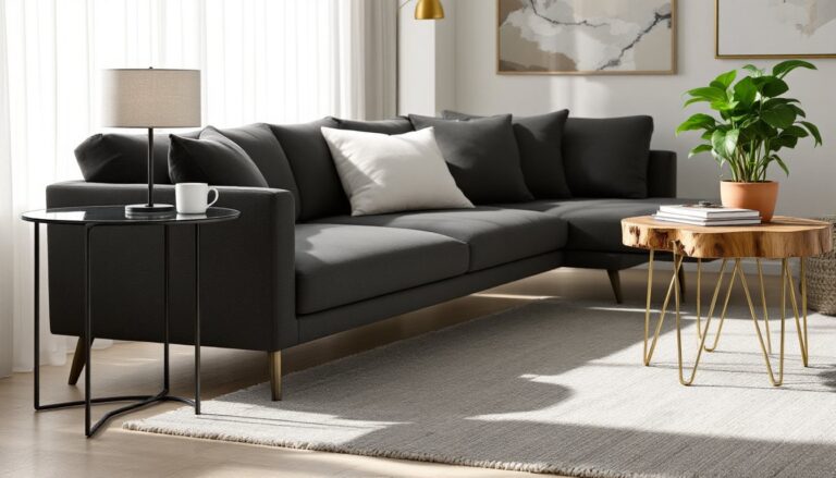
- Accent walls should anchor the room by highlighting architectural features like fireplaces or built-ins, not just fill empty wall space.
- Proper wall preparation—filling nail holes, sanding rough patches, and using low-bleed painter’s tape—determines whether your living room paint job looks professional or amateur.
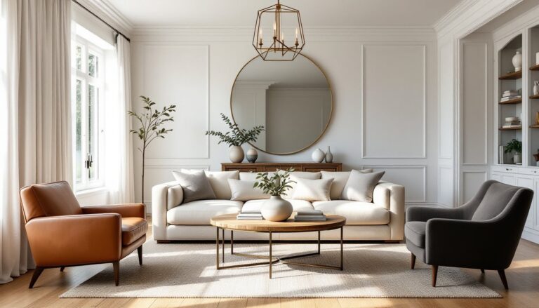
Choosing the Right Color Palette for Your Living Room
Before cracking open a can, consider your lighting. North-facing rooms get cooler, bluer light all day, so warmer paint tones (creams, taupes, warm grays) help balance that chill. South-facing rooms flood with warm light, giving you more flexibility with cooler tones.
Test samples on at least two walls, one that gets direct light and one that doesn’t. Paint a 2-foot by 2-foot square and live with it for a few days. Colors shift dramatically between morning and evening, and that $4 sample pot saves you from repainting an entire room.
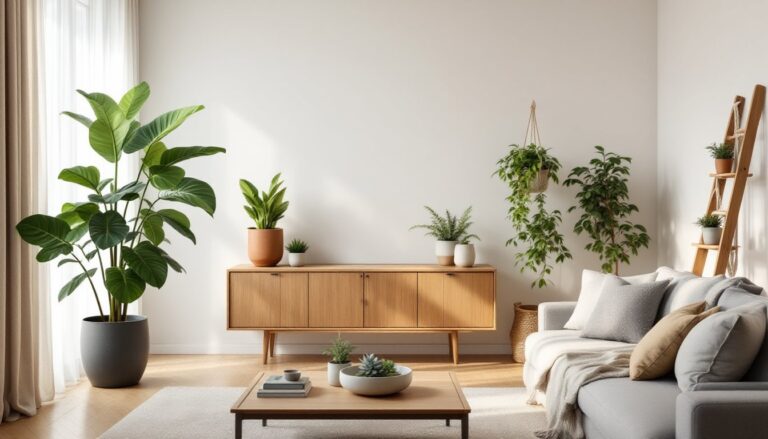
Consider your existing elements. If you’ve got oak trim, cool grays can look dingy next to warm wood. If your sofa is a statement piece, your walls should support it, not compete. Wall color selection impacts how furniture reads in the space.
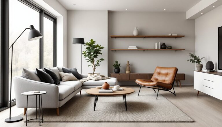
Room size matters, but not the way most people think. Dark colors don’t automatically shrink a room, they can actually make walls recede if you’ve got good lighting. Light colors bounce light around, which helps in dim spaces but can feel stark in bright rooms without enough contrast.
Warm and Inviting Paint Colors
Warm tones create the kind of living room people actually want to sit in. These aren’t your builder-beige nightmares, think terracotta, rust, warm taupes, and creamy off-whites with yellow or pink undertones.
Sherwin-Williams Accessible Beige (SW 7036) is a go-to for a reason. It’s a greige (gray-beige hybrid) that leans warm without going orange. Works with most wood tones and doesn’t look dingy in low light. Coverage is typically 350–400 square feet per gallon for quality paint.
Deeper warm tones like Benjamin Moore Audubon Russet (HC-51) or terracotta shades bring serious depth. These work best with white trim and plenty of natural light. If you’re working with a smaller footprint, consider using these on a single accent wall in compact spaces rather than everywhere.
Cream and ivory aren’t boring when done right. Benjamin Moore White Dove (OC-17) has enough warmth to avoid that sterile look but stays light enough to maximize brightness. It’s particularly effective in rooms with darker furniture or limited windows.
Warm colors show dirt and scuffs less than stark white, which matters if you’ve got kids or pets tracking through your main living space.
Cool and Calming Shades
Cool tones, blues, greens, and true grays, bring a more formal, serene feel. They’re ideal if your living room doubles as a workspace or if you prefer a less stimulating environment.
Benjamin Moore Hale Navy (HC-154) is a deep, sophisticated blue that doesn’t read as dark as you’d expect. It actually makes white trim and artwork pop. Requires good lighting to prevent a cave effect, but when it works, it works.
Softer blues like Sherwin-Williams Sea Salt (SW 6204) shift between blue, green, and gray depending on light. It’s legitimately calming without feeling cold, especially in rooms with warm wood floors or brass fixtures.
True grays are tricky, many have blue or green undertones that only show up after you’ve painted. Sherwin-lings Repose Gray (SW 7015) is one of the more neutral options, leaning neither warm nor cool. Test it against your trim: if your trim is cream or ivory rather than pure white, gray walls can clash.
Sage and muted greens are trending for 2026, particularly earthy, grayed-down versions. Farrow & Ball Pigeon (No. 25) is a blue-gray-green that works surprisingly well with both modern and traditional furniture. These tones connect particularly well with coastal-inspired interiors when paired with natural textures.
Cool colors can make a room feel larger by visually receding, but they also show imperfections in drywall more readily than warm tones. Make sure your prep work is solid.
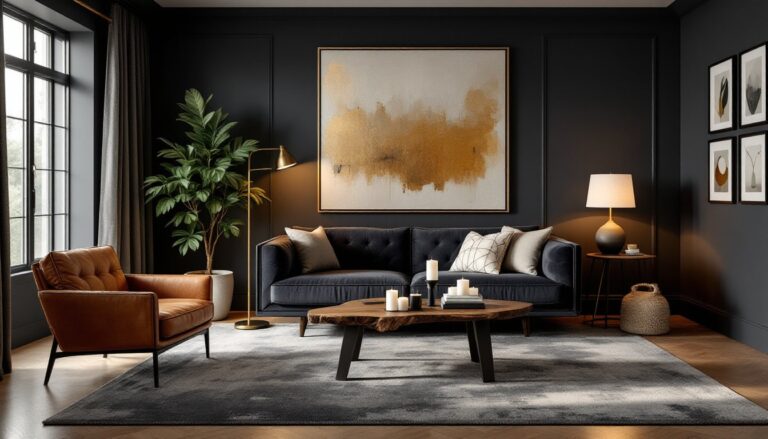
Bold and Dramatic Living Room Paint Ideas
If you’re committing to bold color, commit fully. Half-measures look like you couldn’t decide.
Deep jewel tones, emerald, sapphire, amethyst, create richness that lighter colors can’t touch. Benjamin Moore Deep Royal (2061-10) is a saturated navy-purple that transforms a living room into something special. These colors need ample natural light or strategic layered lighting (overhead, task, and accent) to avoid feeling oppressive.
Charcoal and near-black walls are having a moment, and they’re not as risky as they sound. Farrow & Ball Railings (No. 31) is a soft black with blue undertones that feels moody but not Gothic. The trick: pair it with light floors, bright white trim, and brass or warm metal fixtures. According to designer recommendations for dramatic spaces, this contrast creates visual interest without overwhelming.
Bold doesn’t always mean dark. Saturated yellow or burnt orange can energize a space, but they’re intense, use them in rooms where you want activity and conversation, not relaxation. These colors also shift dramatically with artificial lighting: test under both daylight and evening conditions.
Two coats minimum for deep, saturated colors, often three if you’re going over white. Use a tinted primer matched to your topcoat to improve coverage and reduce the number of finish coats needed. This saves time and material.
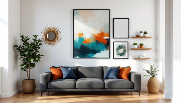
Accent Walls and Two-Tone Techniques
An accent wall is not a way to use up leftover paint. It should anchor the room, typically the wall behind your sofa or the one your eye lands on when entering.
Choosing the right wall: Pick the wall with the most architectural interest (fireplace, built-ins, large window) or the one that naturally draws attention. Painting a random wall just because it’s empty rarely works.
Two-tone horizontal splits are back, but executed differently than the 2000s chair rail look. Run the division at two-thirds height rather than halfway, and use painter’s tape and a level to ensure a clean, straight line. The darker color typically goes below to ground the space, but flipping it can make ceilings feel higher.
For a clean division line, use FrogTape or similar low-bleed tape, and seal the edge with the base color before applying the accent color. This prevents seepage and gives you a crisp line without touch-up.
Vertical divisions work well in open-concept spaces to visually separate zones, say, a sitting area from a dining area, without actual walls. Paint one “zone” a few shades deeper than the other, keeping them in the same color family for cohesion.
Accent walls also provide a low-commitment way to test bold color combinations before painting an entire room. If you hate it, you’re only repainting one wall.
Choosing the Best Paint Finish for Living Room Walls
Finish affects how color reads, how durable it is, and how much prep work you’ll need. Living rooms see moderate traffic, so you have options.
Flat/Matte (0–5% sheen): Hides imperfections beautifully and gives rich, velvety color. The downside: it doesn’t clean well. Scuffs and marks are harder to wipe down without leaving a shiny spot. Use this if your walls are textured or less-than-perfect and you don’t have kids or pets constantly brushing against them.
Eggshell (10–25% sheen): The sweet spot for most living rooms. Slight sheen catches light without looking glossy, hides minor imperfections, and wipes down reasonably well. Brands like Benjamin Moore Regal Select or Sherwin-Williams Duration in eggshell offer good durability for the price.
Satin (25–35% sheen): More washable than eggshell, making it practical for high-traffic homes. It shows imperfections more readily, so wall prep matters, fill nail holes, sand rough patches, and prime properly. Satin works well in active family spaces where cleanability trumps texture-hiding.
Semi-gloss and gloss: Generally too shiny for living room walls but work well on trim, doors, and built-ins for contrast. The reflective quality highlights every drywall flaw.
Application note: Higher-sheen paints show roller marks and lap marks more easily. Work in consistent, overlapping strokes and maintain a wet edge to avoid visible lines. A quality 9-inch roller with ½-inch nap works for most smooth-to-lightly-textured walls.
Conclusion
Paint transforms a living room faster than any other single change, if you choose colors and finishes that work with your space, not against it. Test samples in real lighting conditions, prep walls properly, and don’t skimp on quality paint or primer. The difference between a professional-looking result and a DIY disaster usually comes down to preparation and patience, not talent.