Table of Contents
ToggleDark green is having a moment, and not because it’s trendy, it’s because it works. This color brings depth, warmth, and a grounded elegance that lighter shades can’t touch. Whether someone’s repainting a single accent wall or committing to a full room transformation, dark green offers versatility that pairs with modern, traditional, and eclectic styles alike. But here’s the catch: getting it right requires more than slapping on a coat of paint. From choosing the correct undertone to balancing lighting and furnishings, a modern dark green living room is a DIY project that rewards thoughtful planning and execution.
Key Takeaways
- A modern dark green living room brings sophistication and warmth while hiding imperfections better than lighter paint colors, making it ideal for high-traffic spaces.
- Choose your dark green shade by testing paint samples in natural light and considering undertones—warmer greens suit north-facing rooms, while cooler greens work better in south-facing spaces with abundant sunlight.
- Balance dark walls with light-colored furniture, layered lighting (ambient, task, and accent), and natural light through sheer window treatments to prevent the room from feeling too heavy.
- Incorporate metallics like brass and gold, warm neutrals, and carefully selected accent colors such as mustard or blush pink to complement dark green without competing for attention.
- Proper surface preparation, primer application, and at least two finish coats are essential for achieving professional results when painting a modern dark green living room.
Why Dark Green Is the Defining Color for Modern Living Rooms
Dark green anchors a room in a way few colors can. It reads as sophisticated without feeling cold, natural without skewing rustic. Interior designers have long relied on deep greens, hunter, forest, emerald, to create spaces that feel intentional and lived-in.
Unlike stark grays or cool blues, dark green has warmth embedded in its undertones. It pairs well with natural materials like wood, leather, and stone, making it ideal for homeowners aiming for a modern aesthetic that doesn’t feel sterile. The color also plays well with metallics, brass, gold, and matte black fixtures look striking against a dark green backdrop.
From a practical standpoint, dark green hides imperfections better than lighter hues. Minor dings, scuffs, and uneven textures are less noticeable on a deeply saturated wall. That’s a real advantage in high-traffic areas like living rooms, especially in homes with kids or pets.
The psychological effect matters, too. Green is associated with calm and balance, making it a smart choice for a space meant for relaxation and gathering. Unlike bold reds or stark whites, dark green doesn’t demand attention, it invites it.
Choosing the Perfect Dark Green Shade for Your Space
Not all dark greens are created equal. The difference between a forest green with brown undertones and an emerald with blue undertones can completely change the mood of a room.
Start by considering natural light. North-facing rooms with cooler, indirect light benefit from warmer greens that lean toward olive or sage. South-facing rooms with abundant warm light can handle cooler greens like pine or teal-based options. Test paint samples on at least two walls, one that gets direct sunlight and one that doesn’t, and observe them at different times of day.
Undertones are critical. A green with too much yellow can read as muddy in low light. One with excessive blue can feel cold and uninviting. Hold paint chips next to existing elements in the room: flooring, trim, built-ins. The green should complement, not clash with, these fixed features.
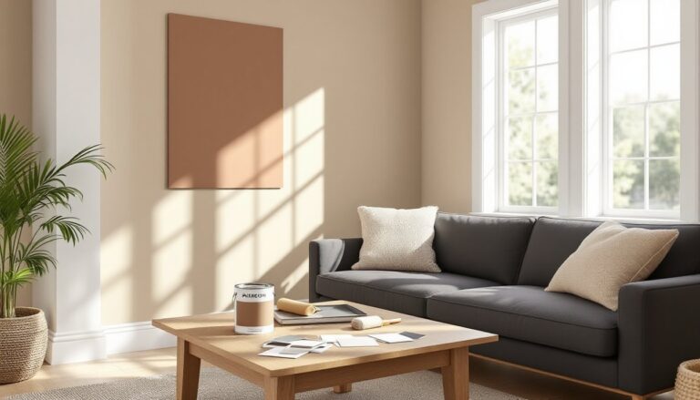
Popular dark green paint options include shades marketed as “hunter green,” “forest,” “deep emerald,” and “botanical.” When selecting a finish, opt for eggshell or satin for living room walls. These finishes hide minor surface flaws better than flat paint while offering easier cleaning than high-gloss.
Buy a quart and paint a 2’x2′ test section before committing to gallons. Live with it for a few days. Dark colors are unforgiving, what looks moody and sophisticated in a tiny swatch can feel oppressive if the undertone is wrong.
Essential Design Elements for a Modern Dark Green Living Room
Dark green walls set the stage, but the room’s success depends on what goes in front of them. Furniture, lighting, and spatial planning all play critical roles.
Furniture Selection and Placement
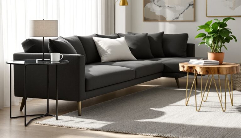
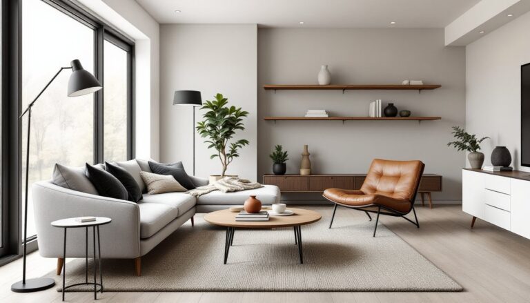
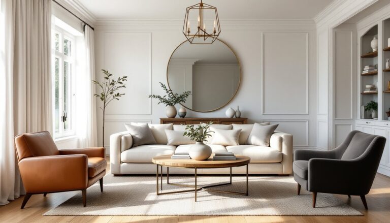
Light-colored furniture provides the most striking contrast. Cream, tan, beige, and light gray sofas pop against dark green walls and prevent the space from feeling too heavy. Leather and linen work particularly well, both have textural interest that adds dimension.
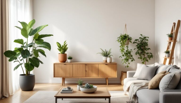
Wood tones matter. Walnut, oak, and teak bring warmth without competing with the green. Avoid overly red-toned woods like cherry, which can clash with certain green undertones. Mid-century modern pieces, tapered legs, clean lines, complement the sophistication of dark green without adding visual clutter.
Scale is important in a dark room. Bulky, overstuffed furniture can make the space feel cramped. Choose pieces with exposed legs and open frames to maintain a sense of airflow. A low-profile sectional works better than a tall-backed sofa that blocks sightlines and light.
Consider color scheme fundamentals when planning the overall palette. Accent chairs in mustard, rust, or blush pink introduce energy without overwhelming the green base.
Lighting Strategies to Balance Dark Green Walls
Dark walls absorb light, so a single overhead fixture won’t cut it. Plan for layered lighting: ambient, task, and accent sources working together.
Start with ambient lighting, overhead fixtures or recessed cans on dimmers. LED bulbs in the 2700K-3000K range (warm white) keep the space inviting. Avoid cool white bulbs (4000K+), which can make dark green look muddy or gray.
Add task lighting where needed: swing-arm wall sconces next to reading chairs, table lamps on side tables, or a floor lamp in a dark corner. These don’t just illuminate, they create visual interest at multiple heights, which is key in breaking up large expanses of dark color.
Accent lighting highlights artwork, architectural features, or plants. LED strip lighting behind floating shelves or under built-ins adds depth and drama. Picture lights mounted above framed art draw the eye and break up the wall plane.
Natural light is non-negotiable. Skip heavy drapes in favor of sheer panels or woven shades that diffuse sunlight without blocking it. If privacy is a concern, use cellular shades that can be lowered from the top, allowing light in while keeping sightlines out.
Mirrors amplify available light. A large mirror opposite a window reflects daylight back into the room and creates the illusion of more space. Frame it in brass or gold to pick up on warm metallic accents elsewhere in the room. Homeowners working with lighting principles should prioritize flexibility and dimming capability.
Complementary Colors and Accent Palettes That Work
Dark green is versatile, but it needs the right supporting cast to shine. The wrong accent colors can make the space feel murky or dated.
Neutrals are the safest bet. White trim, cream textiles, and charcoal gray accents provide clean contrast. They let the green be the star without competing for attention. Warm whites (with a hint of beige or yellow) work better than stark, cool whites, which can feel too clinical.
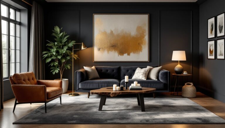
Metallics elevate the room instantly. Brass, gold, and copper introduce warmth and a touch of luxury. Use them in light fixtures, cabinet hardware, picture frames, and decorative objects. Matte black fixtures, curtain rods, shelving brackets, lamp bases, add modern edge without the shine.
Warm accent colors add energy. Mustard yellow, burnt orange, terracotta, and rust create a cozy, autumnal vibe. These work especially well in throw pillows, blankets, and small upholstered pieces. They’re easy to swap out seasonally if tastes change.
Cool accent colors offer a different mood. Blush pink softens the green’s intensity, while navy blue creates a jewel-toned, sophisticated look. Dusty rose and mauve bring subtle femininity without veering into overly traditional territory.
Avoid: bright lime green (too much of the same hue), pure red (can look Christmas-y), and excessive black (makes the room feel heavy). When in doubt, test accent colors with fabric swatches or paint samples before committing to larger purchases.
Texture plays a supporting role in accent selection. Velvet, linen, wool, and rattan all add tactile variety that keeps a monochromatic or limited palette from feeling flat. A modern farmhouse aesthetic can incorporate shiplap or reclaimed wood accents for textural interest alongside the green.
DIY Tips for Achieving a Professional Dark Green Living Room Makeover
Painting dark green walls is more involved than rolling on a coat of beige. Prep work determines the final result.
Surface Preparation is non-negotiable. Patch holes and cracks with spackling compound, let dry, and sand smooth with 120-grit sandpaper. Wipe walls with a damp cloth to remove dust. Dark paint highlights every imperfection, so take the time to get surfaces right.
Primer is essential, especially over lighter existing paint. Use a high-quality stain-blocking primer (gray-tinted versions work best under dark colors). This prevents the old color from bleeding through and reduces the number of finish coats needed. Plan on two coats of primer for best results.
Cutting in requires a steady hand and a quality angled brush (2.5″ works well). Paint the edges, corners, and trim lines first, then roll the main wall area. Work in 3’x3′ sections to maintain a wet edge and avoid lap marks.
Two finish coats minimum. Dark greens rarely cover fully in one pass. Let the first coat dry completely (check the paint can, usually 2-4 hours depending on humidity) before applying the second. Don’t rush this step: incomplete coverage shows as streaky, uneven color.
Tape removal timing matters. Pull painter’s tape while the final coat is still slightly tacky, wait too long and the paint can peel off with the tape. Pull at a 45-degree angle, slowly.
Accent walls vs. full room: If committing to four dark green walls feels overwhelming, start with one accent wall. Choose the wall behind the sofa or the one opposite the main seating area. This tests the color and impact without the full investment. That said, dark colors often look better when used on all walls, they create a cohesive, enveloping effect rather than looking like an afterthought.
Trim and ceiling color: Keep trim bright white or cream for contrast. Paint the ceiling a shade or two lighter than the walls (a pale sage or soft white) to prevent the room from feeling like a cave. Some designers extend the dark green onto the ceiling for a dramatic, moody effect, but this works best in rooms with high ceilings and ample natural light.
Safety: Wear a dust mask during sanding, and ensure good ventilation when priming and painting. Open windows and use a box fan to circulate air. Low-VOC or zero-VOC paints minimize odor and off-gassing.
Cost considerations: Expect to pay $30-$70 per gallon for quality paint, depending on brand and region. One gallon typically covers 350-400 square feet per coat. A standard 12’x14′ living room with 8′ ceilings requires roughly 2-3 gallons for two coats, plus primer. Budget accordingly and buy all paint from the same batch to avoid color variation.
Resources like design inspiration platforms and room styling guides offer visual examples and pro tips for tackling color-heavy projects. Homeowners can also explore wall color strategies for additional context on choosing and applying bold hues. Those working with limited square footage should consider small space solutions to ensure dark colors enhance rather than shrink the room.